NCSoft Corporation
Project Scope
- Design Lead
- Logo Design
- UI/UX Web Design
- Visual Design
Let the Battle Begin!
I was assigned the task of developing a comprehensive user experience for an Esports event from scratch. Although there was an existing website, stakeholders wanted a complete overhaul of the creative direction. The only element they had confirmed was the theme of the upcoming event, titled “Battle Brawl.” This high-priority project involved European Eplayers traveling to the US to compete against North American teams.
My responsibilities included creating a style guide to shape the entire event’s visual identity, including digital assets such as sliders, video overlays, thumbnails, and the responsive Esports website.
Battle Brawl Logo Exploration
Before diving into production, I first needed to identify the target audience. For this project, the focus was not on the Esports professional players, but rather on the Esports audience. This audience is predominantly male, with the largest age group being 16-24, accounting for 38%, followed by 25-34, which represents 35%.
Given that "Blade and Soul" is a Korean fantasy martial-arts MMORPG with a distinct Asian influence, I was tasked with designing a logo for the upcoming Esports event, "Battle Brawl." I began by sketching logo concepts incorporating Asian elements. One challenge I faced was ensuring the design reflected Chinese stylistic influences, rather than Japanese ones, despite their occasional similarities.
Logo Exploration Round 1

Given the nature of the Esports audience, I aimed to design a logo for "Battle Brawl" that conveys a rugged and intense aesthetic. I focused on elements like grungy textures, rusty metal, and a war-beaten appearance to reflect the event's competitive spirit. To ensure the logo resonated with the theme, I avoided a techy, futuristic look and incorporated distinct Asian elements to align with the event's cultural influences.
After spending some time reviewing Blade & Soul artworks, I developed several logo design concepts to present to stakeholders and art directors. For designs 1 through 3, I incorporated oriental-style clouds.
For logos 4 and 6, I used the ninja star (shuriken) and from 7 onwards, I introduced dragons.
For logos 11 through 14, I introduced shield-shaped element at the back of the dragons. The stakeholder and art directors chose number 11 and number 3.
Logo Exploration Round 2
Second round of the logo exploration process, I made more variations of the dragon with shield and the banner with oriental clouds. The winner goes to number 4! I spent more time to refine the dragon and added some treatment to the logo.
Logo Exploration Round 3
Third round and we chose color scheme for number 4. I went back and did more variations to texture, color and text treatments.
Logo Exploration Round 4
Fourth and final round of the logo exploration process. Number 3 was chosen but with slight variation.
The final vector Battle Brawl logo in its glory!
Logo with background treatment.
Logo applied to the upcoming eSports event - Desktop and mobile view
Battle Brawl Style Guide Exploration
Battle Brawl features two teams competing head-to-head: one representing North America and the other from the European Union. Given that the entire eSports event revolves around the theme "Battle Brawl," I envisioned a setting filled with collapsed buildings, swirling atmospheric clouds, and pervasive rubble and chaos. The scene depicts the aftermath of an intense battle, showcasing absolute devastation. To enhance the representation of each team, I considered incorporating recognizable landmarks from each region, highlighting their unique identities amidst the ruin.
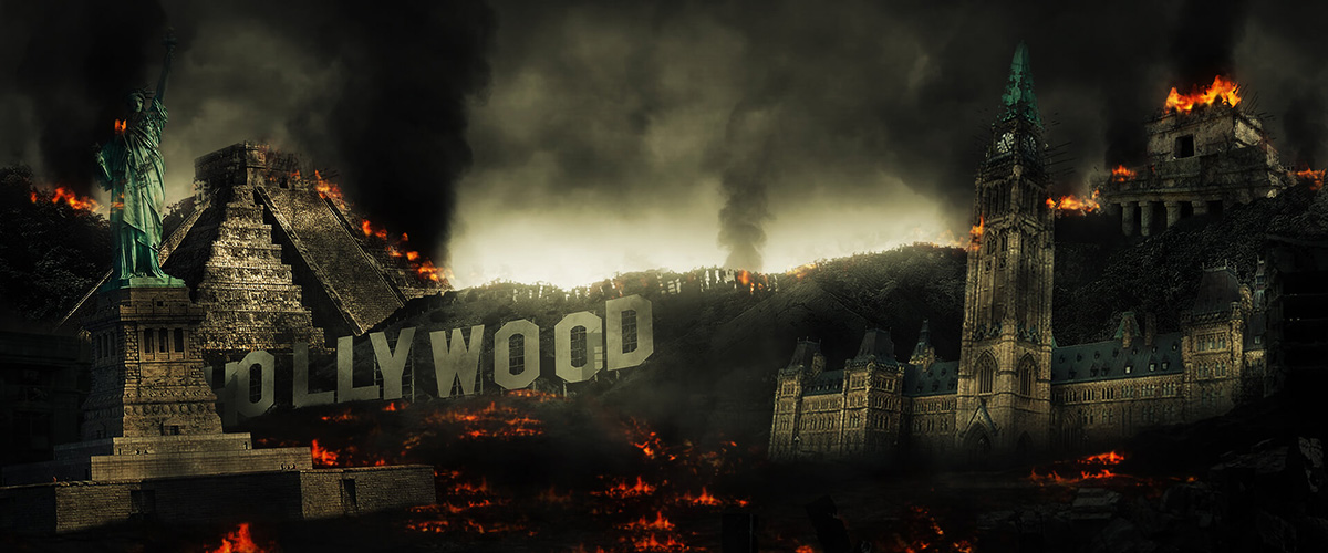
Landmarks from North America were used to represent the North American team. I used billowing black smoke and damaged structures.
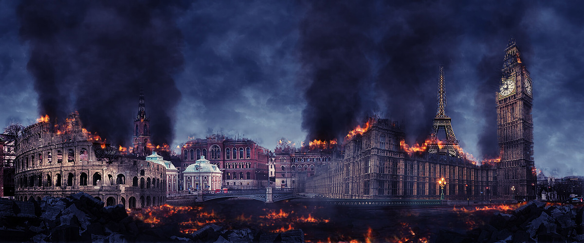
Popular landmarks from the EU .
After careful consideration, the team concluded that depicting destroyed popular landmarks could carry negative connotations and potentially create a poor user experience. To address this UX challenge, I have decided to focus on the destruction of our PvP arenas instead. This approach maintains a sense of familiarity for both existing players and the audience, while avoiding the potential drawbacks of using real-world landmarks.
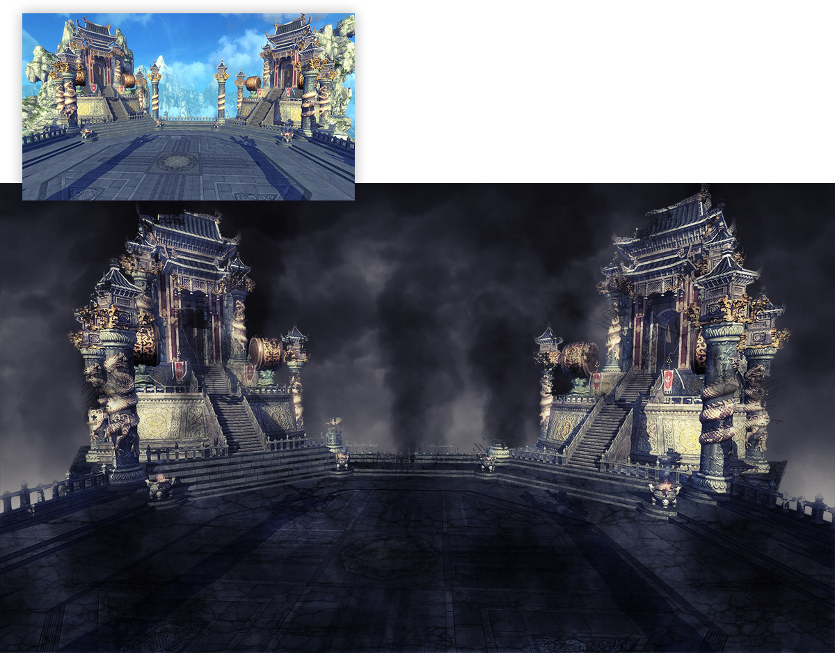
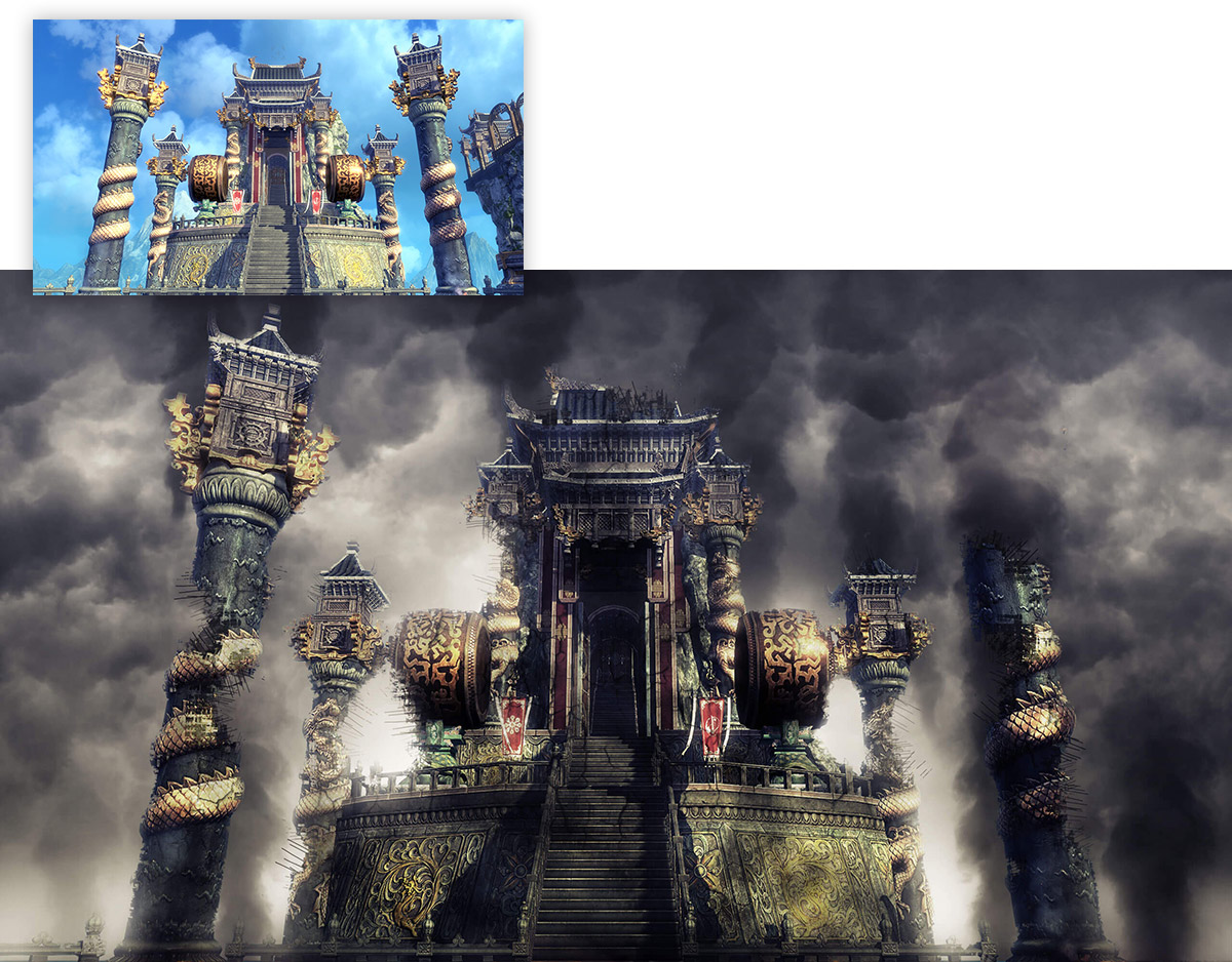
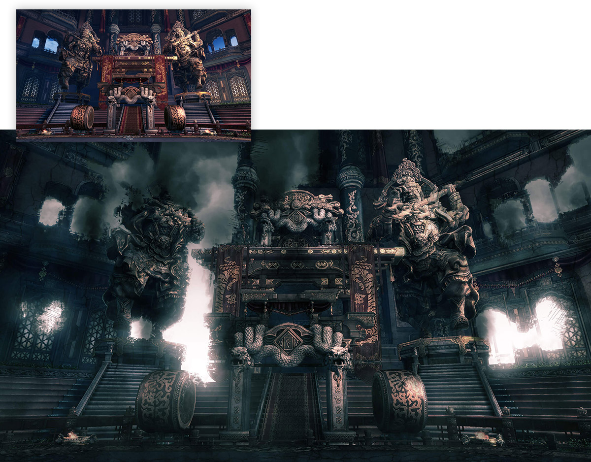
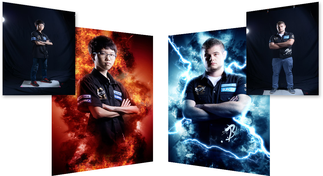
Currently the NA and EU teams are separated by the color red (NA) and blue (EU). Instead of sticking to the colors, I decided to use the elements fire and lightning instead. That way, the audience are still able to identify the teams as the colors are still intact but the fire and lightning gives a more dramatic treatment.
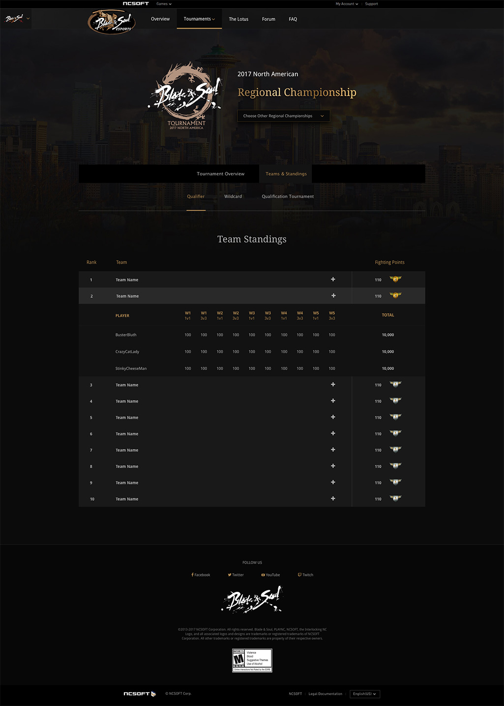
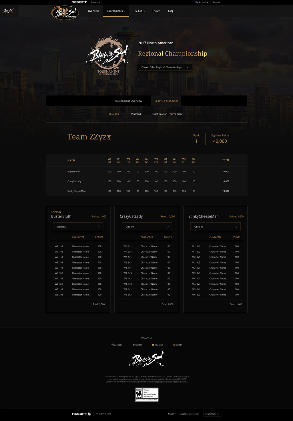
Esports Responsive Website